When people visit a website, it is almost always to read information. Even highly visual sites will contain some written content, giving context and depth to the graphics. It means that the typography, or font, forms a big part of the way that the site gets its message across.
Communicate your website message
Different fonts can give a very different meaning to the same message, so choosing one relevant to the brand and its theme is important.
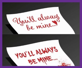
A romantic message can become pretty sinister in the wrong font.
Keep it consistent
Branding consistency helps customers identify you quickly and easily. If they’ve seen an advert, and are looking for the website for more information, using the same branding and typography everywhere tells them that they’re in the right place. The same applies right across the website, uniting different themes
Make sure it says what you think it says
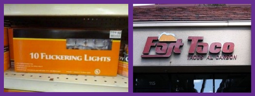
Some fonts might look great in the alphabetised example, and turn into a branding disaster when used to form actual words. Once the website copy has been agreed, it never hurts to take a quick look at how it reads in the brand’s font, just to make sure. People shopping for 10 Flickering Lights, or a Fast Taco might not think you can help, otherwise.
Ensuring legibility makes information easier to read, and site visitors who have had a good experience are more likely to be interested in your products or services.
Headings and subheadings
Using headings and subheadings throughout the web copy helps search engines understand what the key themes of that web page is about. It means that the page is more likely to perform well in the list of results for a relevant search term. We’re putting this bit first because we’re really jolly keen on organic SEO.
Organise and absorb information
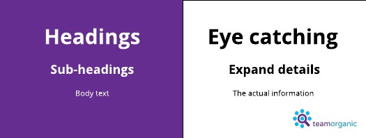
They’re also a useful way to organise information on a page, making it much faster for the reader to find what they’re after. A huge page of content is also easier to absorb if it’s broken down into chunks. Typography can help the reader identify where sections start and end, grouping relevant information together. It means that it stands a better chance of being understood, and therefore useful.
People like aesthetic things
A font that looks good, and relates well to the graphics on your site, is going to give web visitors a more enjoyable experience of your brand. We all naturally gravitate towards things that are attractive, and your typography is no different. If things look nice, the audience is more likely to relate to it, and enjoy interactions, keeping them coming back.
At Team Organic, we really like everything to do with digital marketing. SEO, social media, websites and writing are what we live and breathe, so drop us a line if you want to chat about yours.